Charts
ExSite can generate charts and graphs to assist you in visualizing your data. Charts are generated in SVG format, and can be inlined directly into your output, or referenced separately using a src= attribute to an img tag.
Charts have the following basic properties: title, height, width, and type. The height and width default to 400 pixels. The type is one of pie, bar, line, or time. Line is the default. Examples are shown below.
The chart data consists of arrays/lists of values that are specified using the following properties:
| Property | Example | Description |
|---|---|---|
| data | 1,2,3,4,5 | the dependent variable, or Y-value, of the data to be graphed |
| fields | A,B,C,D,E | the bin, group, or X-value of the data to be graphed |
| series | 2024,2025 | names for the different data series on the chart |
In the simple case, you are plotting a single data series, which is basically just a list of numbers like '1,2,3,4,5'. These values are plotted on the Y-axis of the chart. Each position in this list has a name, which will be plotted on the X-axis of the chart. These names are specified as the fields of the chart.
In more complex cases, you might be plotting several data series at the same time, overlaying them for comparison. Each data series must share the same set of field names. The series will be charted in different colours, and will be identified in the chart legend using the series names you provided in the series property.
Charts will automatically self-configure
- colours and legends
- Y-axis scales, scale intervals, and labels
- X-axis label orientation and time intervals
Pie Charts
Pie charts display a single data series, only. The wedges are labelled with the field names, but there is otherwise no legend.
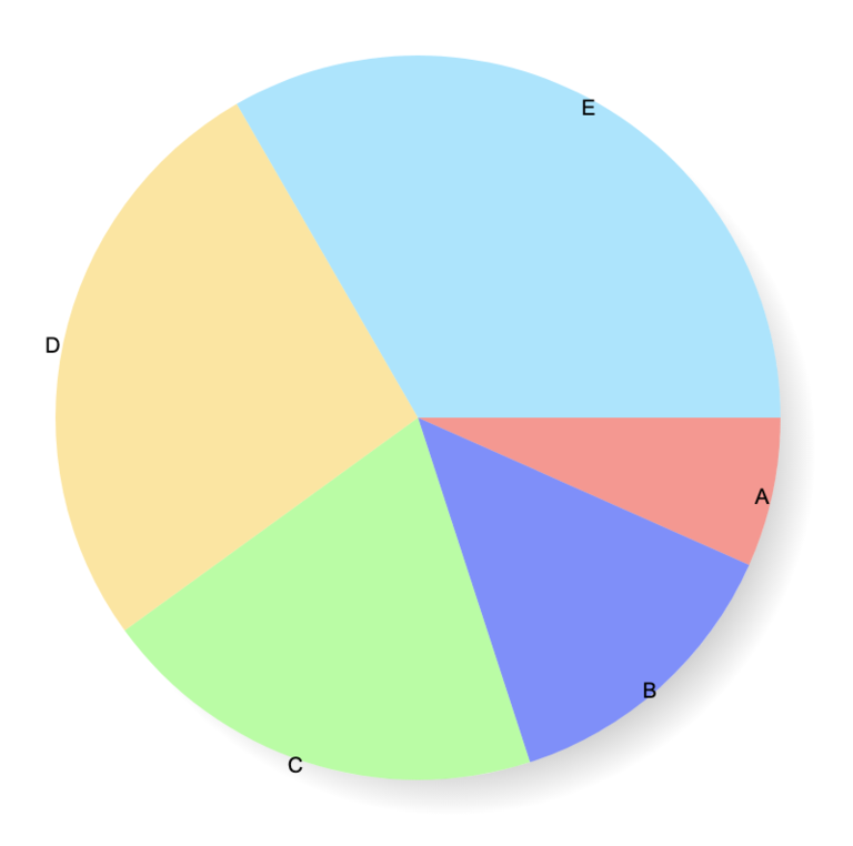
This pie chart was generated using:
| Parameter | Value |
|---|---|
| type | pie |
| data | 1,2,3,4,5 |
| fields | A,B,C,D,E |
For example:
http://your-website.com/cgi/ex.cgi/chart?type=pie&data=1,2,3,4,5&fields=A,B,C,D,E
Bar Charts
Bar charts can display multiple data series. The data "stacks", in other words, the Y-value represents the sum of that field across all of the data series. A legend delineating the different data series is displayed on the right.
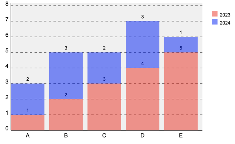
This bar chart was generated using:
| Parameter | Value |
|---|---|
| type | bar |
| fields | A,B,C,D,E |
| data1 | 1,2,3,4,5 |
| data2 | 2,3,2,3,1 |
| series | 2023,2024 |
| height | 300 |
| width | 500 |
For example:
http://your-website.com/cgi/ex.cgi/chart?type=bar&fields=A,B,C,D,E&data1=1,2,3,4,5&data2=2,3,2,3,1&series=2023,2024&width=500&height=300
Note that the first data series was specified in the query string as data1, the 2nd as data2, and so on.
Line Charts
Line charts can display multiple data series that share the same scale (same fields, comparable Y-scale).
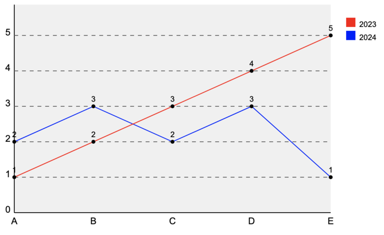
This line chart was generated using the same settings as the bar chart, previously, except for type=line.
For example:
http://your-website.com/cgi/ex.cgi/chart?type=line&fields=A,B,C,D,E&data1=1,2,3,4,5&data2=2,3,2,3,1&series=2023,2024&width=500&height=300
Time Charts
Time charts are similar to line charts, except that the fields represent dates/times. This allows for spacing where gaps in the data occur, and for prettier formatting of the X-axis labels.
Field names should be specified as ISO standard datetime values, ie. YYYY-MM-DD HH:MM:SS. Times are optional, and usually left off because most time-series charts are used to display daily or monthly values.
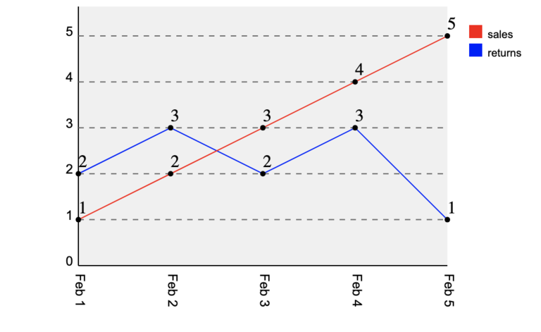
This time chart was generated using:
| Parameter | Value |
|---|---|
| type | time |
| fields | 2025-02-01,2025-02-02,2025-02-03,2025-02-04,2025-02-05 |
| data1 | 1,2,3,4,5 |
| data2 | 2,3,2,3,1 |
| series | sales,returns |
| height | 400 |
| width | 500 |
For example:
http://your-website.com/cgi/ex.cgi/chart?type=time&data1=1,2,3,4,5&fields=2025-02-01,2025-02-02,2025-02-03,2025-02-04,2025-02-05,&data2=2,3,2,3,1&series=sales,returns&width=500&height=400
Note the slightly-increased chart height; this is because of the additional room occupied by the rotated X-axis date labels.
Chart Generation
From URLs
The above examples how how to generate those charts directly using a URL that specifies that chart parameters in the query string. These URLs can be used directly in img tags. When specifying multiple data series using img src URLs, specify the data series sequentially using data1, data2, etc.
Alternatively, you can POST your chart parameters to /cgi/ex.cgi/chart.
In both of the above cases, the chart is generated in a separate server call. Note that use of charts in this way is restricted to executive users, to prevent abuse of your website as a free charting service.
From Reports
Because charts are often visualizations of report data, the ReportBuilder class has a method to convert any report into a chart, as follows:
$out .= $report->chart(%options);
You do not need to provide any option parameters; it will automatically scan your report for chartable data. If you don't like the results, or would like more control over the output, you can specify the following options:
type=> line, bar, piexcol=> column # to use for X data (will default to integer sequence)ycol=> column #(s) to use for Y data series (can pass multiple in an arrayref)title=> defaults to report titlewidth, height=> dimensions of the chartrows=> [array of report row indices to chart]
Specifying ycol is important if you want to control what gets charted.
From the Charts Plug-in
The Charts plug-in provides a control panel interface to the charting tools. These allow you to manually enter your chart parameters into a form and generate charts at the click of a button. The resulting chart can be exported a variety of ways, including:
- URLs for use in img tags
- Plug-in codes to insert into your web pages
- SVG data to be inlined into your HTML
- screenshotted and converted to other image formats
From Perl
Using the Charts API, you can generate charts in your Perl code and insert hem straight into your HTML output.
Start by creating a chart object:
my $chart = new ExSite::Chart(%options);
The %options can include any of the chart parameters noted above, including type, title, height, width, fields, data, and series.
You can also set parameters using separate calls for any of these, for example:
$chart->width(800);
$chart->series("2023","2024");
Add a data series to your chart using:
$chart->add_data(@data);
You can add as many data series as you like. Each one is added with a similar call. You must add the complete data series in a single call.
When naming your fields, take care to ensure that the number of fields matches the number of data points in your series. When naming your series, take care to ensure that the number of series matches the number of calls to add_data().
When calling series(), fields(), or add_data() to pass a list of values, you can specify the list in the following ways:
- an array of values
- a reference to an array of values
- a string containing a comma-delimited list of values
To fetch the SVG for the chart, use
my $svg = $chart->make;
This can simply be inlined straight into your HTML:
$out .= $svg;
or alternatively, wrapped in some sort of container, eg.
$out .= $ui->BasicBox(title=>"My Chart",pane=>$svg);
$out .= $ui->Figure(img=>$svg,caption=>"A description of this chart.");
You can clear your chart object to start over:
$chart->cleardata; # clears just the data
$chart->clear; # clears all settings
Live Examples
To see real examples of charts in your administrator screens, check out the following:
- Charts module : interactive chart generator
- Membership module : the visualizer tool has multiple charts
- Financial Reports : the daily and monthly summaries show time charts and pie charts